After the more cartoony and simple presentation of Slay the Spire (the most famous and probably well-regarded of card battle games), the distinctive aesthetic of Deck of Ashes immediately drew me in.
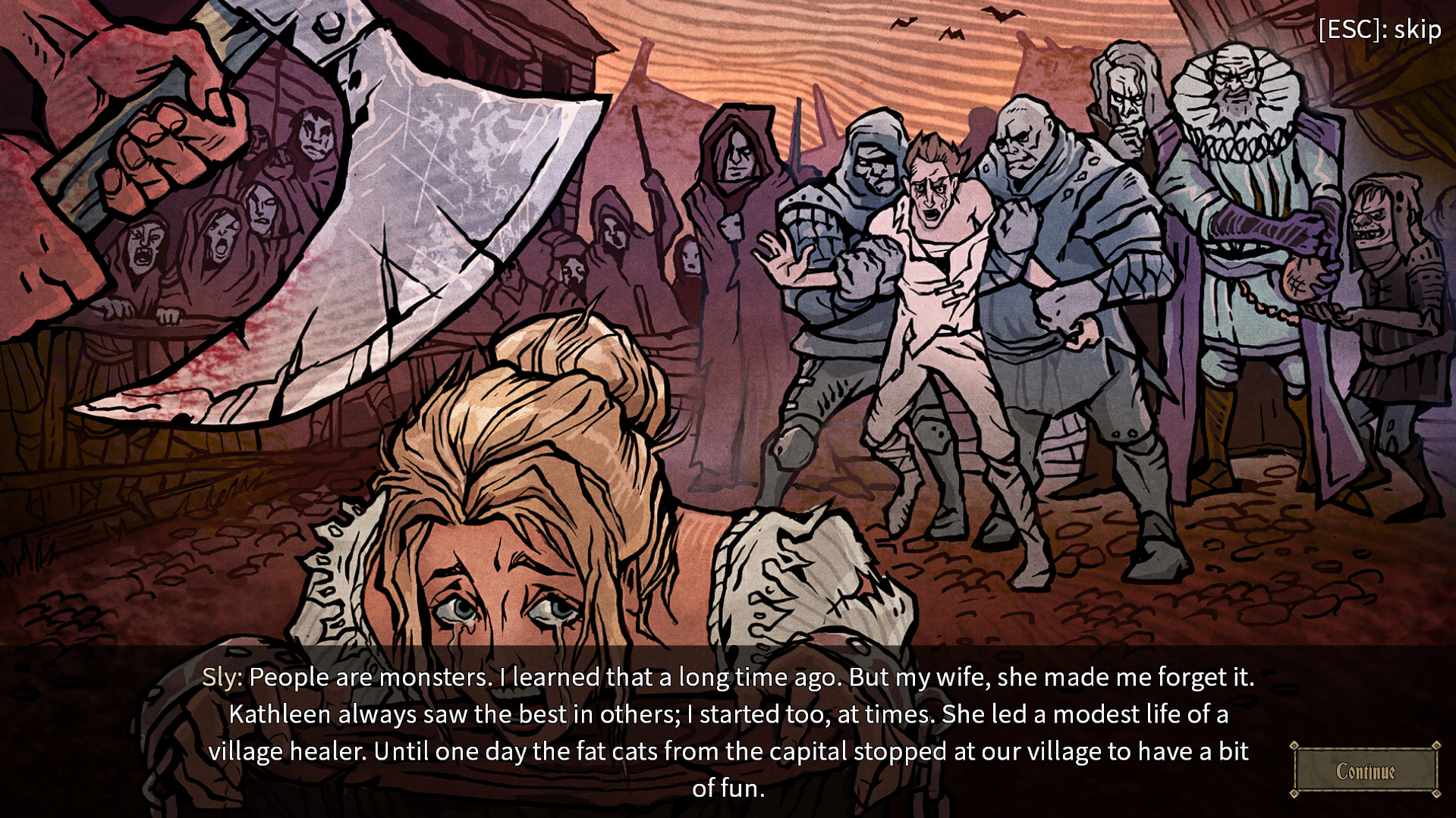
Hand-drawn, Lovecraftian creatures abound. Ghoulish witches and genuinely unsettling undead creatures litter the battlefield, and I am all in favour of it.
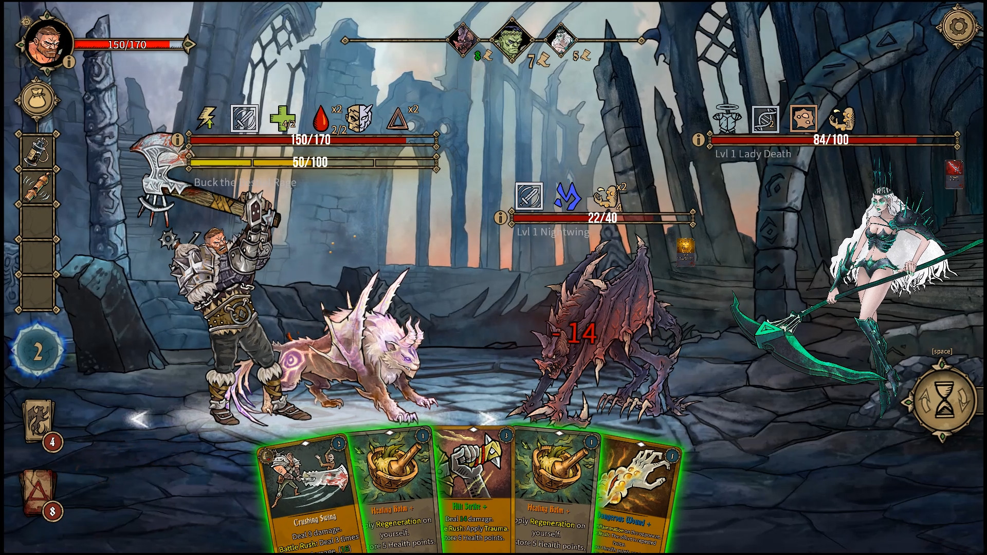
On top of this, the battles themselves are brought to life by creepy animations (the jester character sprouts monstrous claws from his back when he attacks) and a suitably gothic soundtrack.
To those who are fans of the genre, the basic mechanics are familiar. A deck of cards is used to establish your defence and attack against one or more gruesome foes in a series of battles. The basic idea is simple to get to grips with, as with others like it.
I didn’t find the overall plot that interesting, but I wonder if I lost track/interest in it due to the unnecessary complexity of the game. Unlike some games of the type, there is quite a detailed game outside the battles themselves and though this initially whets my whistle, I felt bogged down by it quite soon.
Your quest (to take on Lady Death and break a curse, if you’re interested) takes you to locations on a world map. And the map screen itself highlights my gripe about the excessive detail. I’m sure there are some for whom layers upon layers of stats and collectables are a plus, but not for me.
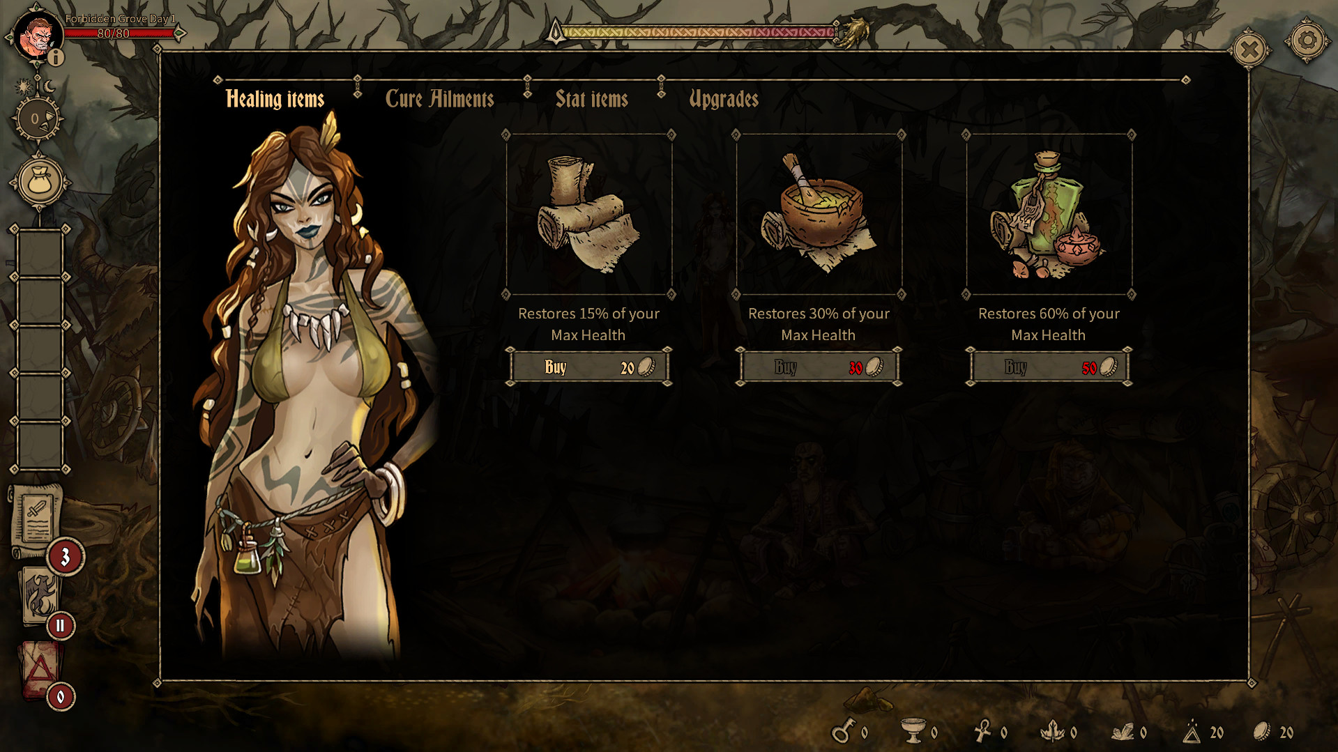
To illustrate, on the map screen there are seven different items that can be collected (Gold, Herbs, Goblets, “Ash”, Keys, Ore and Relics). These can all be used and crafted to improve your starting deck, to better beat the beasties during your quest. But it’s just too much and clutters the whole experience. Worse still, is that the same affliction blights the main course, the battles themselves.
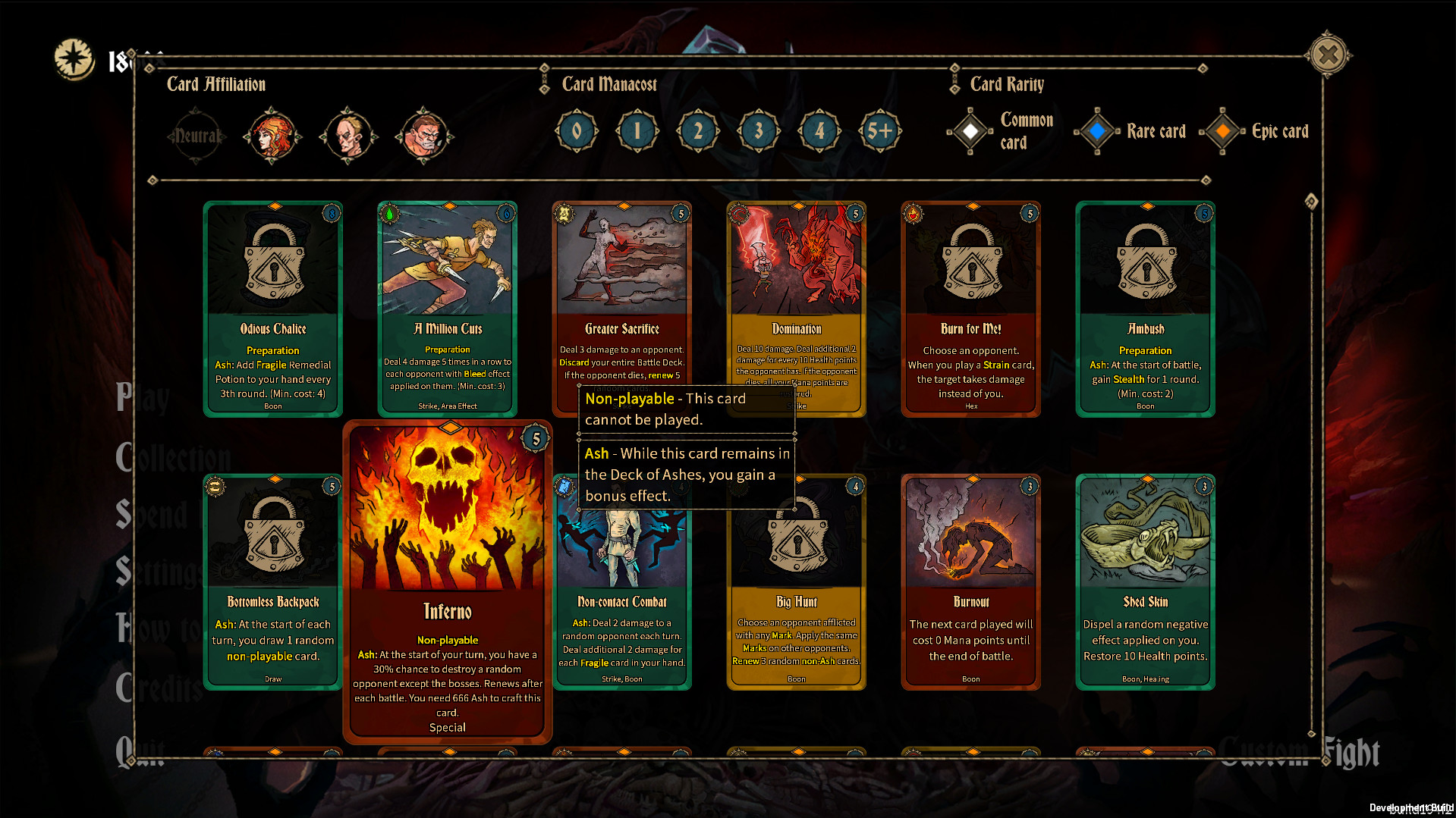
With so many modifiers possible, the cards often have four of five lines of text, referring to the numerous positive or negative effects that can be brought about to change the course of combat. This meant that rather than being able to make reasonably swift, intuitive decisions, I spent time each round acquainting myself with the effects on each card. It felt like I was playing a game that was being live translated from French or something. It had the effect of making the game feel like more work than pleasure.
The detail can be a positive in that it gives a richer experience and feels more involved than other card battle games, with replayability enhanced by the presence of a host of characters being available to play, as well as Draft Mode (where you build a deck rather than have a ‘stock’ character one)
I wanted to enjoy Deck of Ashes more than I did, or as much as the initial impressions led me to think I would, but I found the experience to be cluttered and simply not smooth nor accessible enough.
Deck of Ashes is available on Xbox now


No comments:
Post a Comment
Like what you see in the Games Freezer?
Why not tell us what you think with a few well-chosen comments? :)
Note: only a member of this blog may post a comment.